
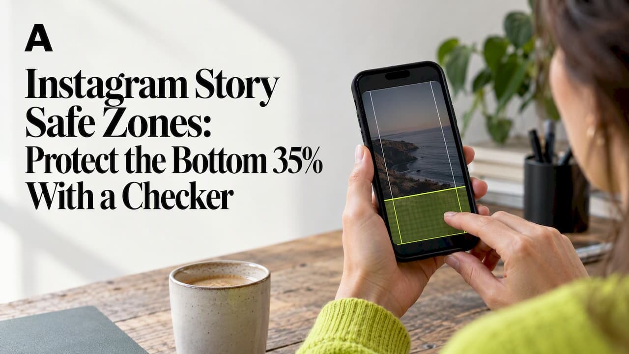
For a 1080 by 1920 Instagram Story, keep roughly 14% clear at the top, 35% clear at the bottom, and 6% clear on each side: about 269 px, 672 px, and 65 px respectively. That leaves a central working box of around 950 by 979 pixels for text, logos, and calls to action. These figures follow Meta's own ad-spec guidance for Story placements.
Key Takeaways
Design Instagram Stories with safe margins of approximately 14% top, 35% bottom, and 6% sides to ensure core content is visible across all device interfaces.
| Point | Details |
|---|---|
| Use safe zone margins | Maintain the central safe area of about 950 by 979 pixels on a 1080 by 1920 canvas to prevent overlap with interface elements. |
| Place critical elements carefully | Position logos, CTAs, and headlines within the safe zone, avoiding the bottom 35% where reply bars and swipe prompts appear. |
| Utilize checking tools | Run assets through safe-zone checkers and mockup generators to verify margins and prevent layout issues before publishing. |
| Scale designs proportionally | Adjust safe margins for higher resolutions to keep the same relative clear space across different device sizes. |
| Follow Meta's guidelines closely | Align your design margins with Meta's official specifications, which are built into our recommended tools and templates. |
Table of Contents
- 1. Instagram story dimensions and safe zones
- 2. Visual placement guidelines for text, logos, and CTAs
- 3. Three story templates to copy and adapt
- 4. Tools and checkers to confirm safe zones before publishing
- 5. Why these margins match Meta's own guidance
- 6. What scaling story production without layout mistakes actually takes
- 7. Verify every story in seconds with Adhook's free tools
- FAQ
- Sources
1. Instagram story dimensions and safe zones
Instagram Stories render at 1080 by 1920 pixels, but the full canvas is never fully visible to the viewer. Profile icons, the reply bar, captions, and sticker tray all sit on top of your design, and if your text or logo lands underneath one of them, it gets covered.
Meta's guidance sets safe margins at approximately 14% top, 35% bottom, and 6% per side. On a standard 1080 by 1920 canvas, that converts to:
- Top margin: leave clear space for interface elements
- Bottom margin: leave clear space for interface elements
- Side margins: leave clear space for interface elements
- Resulting safe box: approximately 950 by 979 px, centered on the canvas
If you work at a higher resolution, scale the clear margins proportionally to keep a similar safe area. You can check Meta's guidance and more sizing details on our Meta ad specs page. You can check these figures and more sizing details on our Meta ad specs page.
The elements most likely to overlap your edges are the profile photo and username in the top-left corner, the close button in the top-right, and the reply field or swipe-up prompt across the bottom. On ads, a "Sponsored" label and CTA button add further overlap near the bottom edge. Device notches, rounded corners, and third-party apps that add their own UI chrome introduce small variations, which is exactly why designers treat the central safe box as the one dependable zone rather than trying to track every device's quirks.
2. Visual placement guidelines for text, logos, and CTAs
Once you know the safe box, the next step is deciding what goes where inside it. A few rules keep layouts legible and on-brand across devices.
- Keep headlines to one or two short lines, with a maximum of around 30 to 35 characters per line, and set body copy no smaller than 24 px at 1080 by 1920 so it stays readable on small screens.
- Use comfortable line spacing to avoid cramped text, and leave breathing room between stacked text blocks.
- Place logos in a corner of the safe box, with clear space around them; switch to a reduced mark or watermark version when the full logo competes with other elements.
- Keep primary CTAs and tappable text above the bottom margin line, never inside the lower 35%, since that band is where reply bars and swipe prompts live.
- Account for motion: if you animate text or layer graphics, check that no frame pushes a key element outside the safe box, since animation can shift what looks "centered" at any given moment.
- Export as PNG for static graphics with text, since compression artifacts in lower-quality JPEGs blur fine text edges; for video, export at the platform's recommended bitrate to keep captions crisp.
Pro Tip: Design at 1080 by 1920 with your safe-zone guides turned on from the first draft, not as a final check, so you never have to rebuild a layout around text that got clipped.
3. Three story templates to copy and adapt
These layouts cover common Story use cases, and each respects the safe box.
- Template A, single-product spotlight: center the product image in the middle of the canvas, place the headline in the upper third of the safe box, and keep the logo small in the top-left corner inside the margin.
- Template B, lifestyle image with caption: use a full-bleed lifestyle photo, drop a short caption into the lower-central area of the safe box, and keep the CTA sitting just above the bottom margin rather than inside it.
- Template C, promo with bold CTA: build the button-style graphic and its CTA text in the upper half of the safe box, since app overlays and reply bars are more likely to intrude near the bottom.
- Adapting for video: keep any static title, logo, or button in the same safe-box position for the full clip, since a CTA that is safe in frame one but drifts by frame three defeats the purpose of the margin.
Each template works for both organic Stories and paid placements, since the same UI elements overlap both formats.
4. Tools and checkers to confirm safe zones before publishing
Rather than eyeballing margins, run your asset through a dedicated overlay tool before you post or launch. A safe-zone checker places the exact pixel margins over your upload so you can see, in seconds, whether your logo or CTA sits in a clipped area. Our Instagram Story Safe Zone Checker and overlays helps you check your image against safe-zone margins.
Use a mockup generator when you want to see your creative inside an actual phone frame and app chrome, which catches issues an overlay alone might miss, like a reply bar sitting at an unexpected height. Run these checks on every asset:
- An overlay preview against the safe-zone margins
- An aspect-ratio check against the platform's required dimensions
- A character-limit preflight for any text baked into the ad
5. Why these margins match Meta's own guidance
The margins throughout this guide, 14% top, 35% bottom, and 6% per side, come directly from Meta's ad-specs guidance for Story placements. We built our Safe Zone Checker, mockup generator, and preflight checker to help you check a sample asset before committing to a final design.

6. What scaling story production without layout mistakes actually takes
Once you're producing more than a handful of Stories a week, manual eyeballing stops working. The fix is building safe-zone overlays and a preflight check into your asset pipeline from the start, not patching layouts after a client or ad reviewer flags them. Consistent margins across every template cut last-minute redesigns and lower the odds of a rejected ad.
— TheAdHook
7. Verify every story in seconds with Adhook's free tools
We built our Instagram Story Safe Zone Checker and overlays so you can check any Story asset against safe-zone margins.

- Our free Meta ad tools include the safe-zone checker alongside a mockup generator and a preflight checker for character limits and spec compliance.
- Beyond checking layouts, our AI static ad generator turns a product URL into a finished Story or Feed ad in minutes, with copy and imagery already sized to Meta's specs.
- Plans start with Starter at $49 per month or $468 per year, and every tier includes credits that never expire.
Try the checker on your next Story asset, or generate a ready-to-launch ad from a product link and skip the manual layout work entirely at Theadhook.
FAQ
What is an Instagram Story safe zone?
An Instagram Story safe zone is the central area of the canvas that stays visible once profile icons, reply bars, and other interface elements are layered on top. On a 1080 by 1920 Story, that safe area is roughly 950 by 979 pixels, based on Meta's guidance of 14% top, 35% bottom, and 6% side margins.
How many pixels should I leave at the top and bottom of a story?
Leave approximately 269 px at the top and 672 px at the bottom of a 1080 by 1920 canvas, which matches Meta's recommended 14% and 35% margins. On a 1440 by 2560 canvas, the equivalents are about 358 px and 896 px.
Where should I place my logo on an Instagram story?
Place your logo in a corner of the safe box, with clear space around it. A reduced or watermark-style logo works better than a full lockup when space near the top is tight.
How do I check if my story design respects the safe zone?
Run your finished asset through a safe-zone overlay tool, such as our Instagram Story Safe Zone Checker, which maps the exact margins onto your upload. Following that with an in-app or mockup preview catches any device-specific overlap the overlay alone might miss.
Do safe zones apply to both organic stories and story ads?
Yes, the same interface elements, like the reply bar and profile icon, overlap both organic and paid Story placements, so the same margins apply to each. Story ads add a "Sponsored" label and CTA button near the bottom, which makes staying clear of the lower 35% margin even more important.